Picture this: You’ve invested time and resources into a custom banner, only to watch it blend into the background. Disappointing? Absolutely. As the market becomes more crowded, Business banners serve as essential tools for standing out in the marketplace clutter. A good banner should make your brand look trustworthy and still grab attention.
The blog will explore some common mistakes people make when creating custom banners, followed by best practices to prevent them, so your message can capture attention and generate results.
What Are Custom Banners?
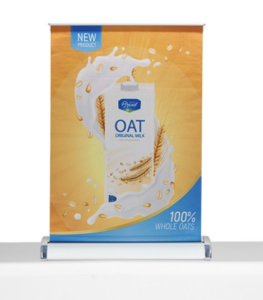
Custom banners are tailored, large-format printed materials designed to promote your brand, event, or message. They help people remember and recognize your business, making them ideal for a range of applications. Outdoor banners, for instance, are made from durable, weather-resistant fabrics to withstand rain and wind, while indoor banners focus on vibrant colors and sharp graphics for high-impact visuals in controlled environments. From promotional banners at trade shows to business banners outside retail stores, these tools are a cost-effective way to amplify your visibility and reinforce your brand identity.
At Bullseye Promotions, we specialize in creating professional banners that combines creativity with practicality. Whether you need eye-catching custom banners and flags for a grand opening or sleek customized banners for a corporate event, our expertise ensures your vision translates seamlessly into reality.
The Need to Stand Out in a Crowded Market
Let’s be honest: Consumers are exposed to thousands of ads daily. How do you ensure your banner doesn’t become part of the static? The key is to plan your banner so the design, colors, and location all work together to grab attention.
Consider color psychology in marketing. Red evokes urgency, blue builds trust, and green suggests sustainability—each hue subtly influences viewer behavior. Pair this with smart banner placement tips, such as positioning outdoor banners near high-traffic roads or indoor banners at eye level in lobbies, and you have a winning formula. However, even the best concepts fall flat without flawless execution. A single design misstep—such as poor font choices or cluttered layouts—can make your banner invisible.
What Are the Common Mistakes to Avoid?
Steering clear of these seven errors will ensure your custom banners and signs command attention:
1. Overloading with Text or Graphics
Less is always more. A banner isn’t a brochure—it’s a visual hook. Stick to a bold headline, a concise call to action for banners (“Visit Us Today!”), and imagery that aligns with your brand. Too much text overwhelms viewers; aim for readability within 3–5 seconds.
2. Ignoring Banner Placement Tips
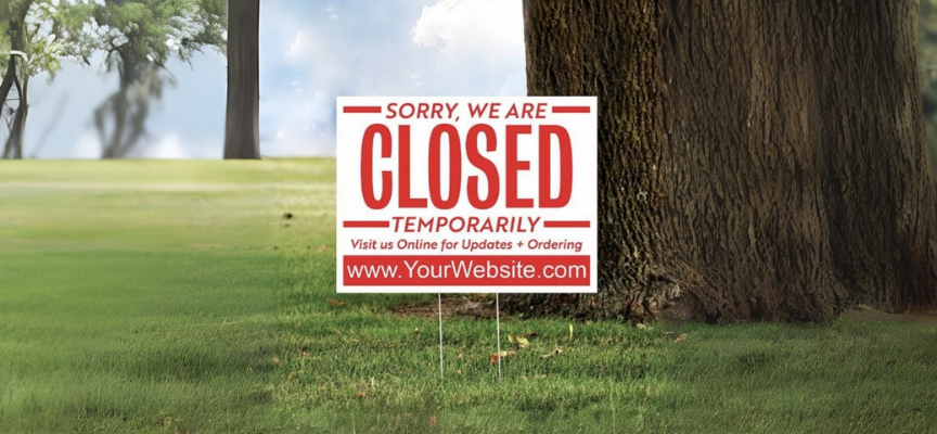
A banner designed for indoor use won’t survive a storm, and an outdoor banner placed in a shadowy corner loses its purpose. Always tailor materials and design to the environment. For example, outdoor banners require fade-resistant inks and heavy-duty vinyl, while indoor banners benefit from glossy finishes for a more vibrant color pop.
3. Using Low-Resolution Images
Blurry pictures make your banner look unprofessional. Choose high-quality banner materials and large-format printing to achieve crisp, professional results. At Bullseye Promotions, we use state-of-the-art printers to guarantee your logos and images stay sharp, even at billboard sizes.
4. Poor Font Choices
Ever squinted at a banner while driving past? That’s what happens when typography for advertising isn’t prioritized. Avoid script or overly decorative fonts. Instead, choose the best fonts for banners, such as bold sans-serifs (like Arial or Helvetica), that are legible from a distance.
5. Neglecting Color Contrast
A white font on a pastel background? Big mistake. High-contrast combinations (e.g., black on yellow) ensure readability. This is where understanding color psychology in marketing and typography for advertising pays off—literally.
6. Forgetting Your Brand Identity
Your banners should mirror your brand’s voice, colors, and logo. Inconsistent branding with banners can confuse customers and dilute recognition. If your logo uses navy and gold, don’t switch to neon green “just for fun.”
7. Skipping Proofreading
Typos happen, but they shouldn’t happen to you. A misplaced comma or misspelled slogan can turn a professional banner into a punchline. Always double-check before sending files for custom banner printing.
Why Is It Important to Avoid These Mistakes?
A badly designed banner can make people doubt your business’s quality. Imagine a potential client spotting a promotional banner with spelling errors or pixelated images. They’ll question your attention to detail, right? On the other hand, effective banner design builds trust, reinforces professionalism, and motivates engagement.
Outdoor banners need to endure UV rays and rain, while indoor banners demand vibrant inks that won’t fade under fluorescent lighting; therefore, material quality matters. Cutting corners on high-quality banner materials risks your message getting lost—both literally and figuratively.
How to Design an Effective Custom Banner
Ready to create a banner that stops people in their tracks? Follow these steps:
1. Define Your Goal
Are you promoting an event, sale, or brand awareness? Align your design with this objective.
2. Prioritize Readability
Use large fonts, high contrast, and minimal text. Test visibility by viewing the design from 10 to 15 feet away.
3. Leverage Color Psychology
Choose hues that evoke the right emotions. For example, red is for urgency, and green is for eco-friendly brands.
4. Incorporate a Strong Call to Action
Phrases like “Shop Now” or “Limited Time Offer” guides viewers on what to do next.
5. Partner with Experts
Bullseye Promotions offers end-to-end solutions, from graphic design for banners to custom banner printing. Our staff ensures your vision is executed flawlessly, using durable materials and advanced printing techniques.
Here’s a quick checklist to keep your project on track:
| Do’s | Don’ts |
| Use high-quality banner materials | Use low-resolution images |
| Limit text to 1-2 short lines | Overcrowd with details |
| Test readability from a distance | Assume colors look the same on-screen and printed |
| Align with brand guidelines | Experiment with off-brand colors/fonts |
Maximizing ROI with Strategic Banner Use
Even the best-designed banners underperform without smart placement and timing. Here’s how to get the most bang for your buck:
- Rotate Banners Seasonally: Swap promotional banners for holidays, sales, or new product launches to keep content fresh.
- Combine Indoor and Outdoor Banners: Use outdoor banners to drive foot traffic and indoor banners to highlight specific offers.
- Monitor Competitors: What’s working for others? Adapt their successes (without copying!) into your banner marketing strategy.
At Bullseye Promotions, we help businesses navigate these nuances. Our professional banners are designed to withstand the elements, capture attention, and align with your brand’s uniqueness.
Bullseye Promotions: Hit the Mark with Professional Banner Design
Designing custom banners, signs, or any promotional banners, is a blend of art and strategy. By avoiding common banner design mistakes and focusing on clarity, consistency, and quality, you’ll create advertising banners that not only captivate but also persuade.
Remember, your banner is often the first interaction customers have with your brand. Make it count. At Bullseye Promotions, we’re committed to helping you nail every detail. From graphic design for banners to large format printing, our team ensures your message is bold, clear, and unforgettable. Ready to elevate your brand’s visibility? Let’s create something remarkable together.